A Placemaking Journal
Municipal Placemaking Mistakes 01: Quantity over quality
Today we begin a PlaceShakers experiment. Through a series of periodic posts, Nathan Norris will explore how cities hinder their own placemaking efforts, wasting time and money by investing in tools, policies and programs that deliver lousy results. In the process, we’ll be looking to you to help flesh out the content through examples, personal experiences and links to additional resources. The goal? A one-stop, crowdsourced primer for cities and towns seeking advantage in an ever-competitive world.
Mistake #1: Judging urban development projects on their quantity of budget/unit count as opposed to the quality of their functional design details or return on investment.
For better or worse, real estate development in the United States is a political act. As such, politics decide whether a project is built and, if so, under what conditions.
Unfortunately, the political discourse over urban projects is typically dumbed down to the most superficial of issues.
On the one hand is the developer who will highlight the project’s positive economic impacts by trumpeting its budget or unit count. On the other are the opponents who claim that the faults of the project can be cured by more expensive exterior materials or by planting a richer landscape.
This gets us nowhere. Rather than focusing on the quantity of the budget or the cost of the exterior materials, the political discourse should focus on whether the development advances the vision of the city as set out in its rules and regulations.
If a city is interested in improving the urban experience, its rules and regulations will govern the functional design details that are found in a form-based code — issues such as fenestration, build-to lines, entrance height, etc.
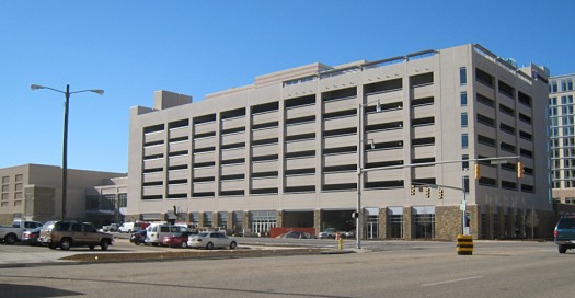
Instead, we get dumbed-down discussions around things like exposed parking decks (what Victor Dover has referred to as “naked”). For example:
This parking deck is part of a convention center and hotel project that was needed for its city. Unfortunately, the complex was designed so that the long side of the parking deck overlooks the most heavily traveled intersection in the downtown area.
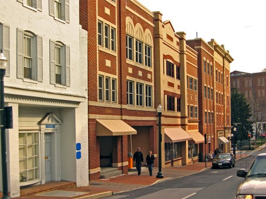
It could have been designed mid-block, or with liner-buildings, or with a façade that respected its location, like this parking deck in Staunton, Virginia:
But it wasn’t, because the discussions that drove it failed to fully address the project’s specific details and returns. So what can others do to avoid a similar fate?
One effective tool for highlighting the qualitative differences between these two design approaches is to shift the discussion of a project from its cost to its value.
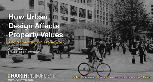
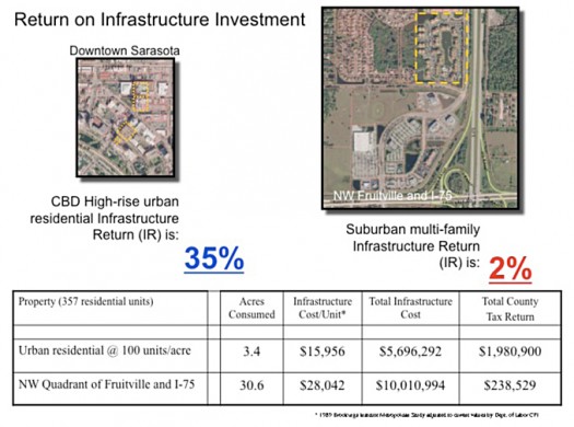
This can involve the use of Andrew Burleson’s Net Attraction Framework or Joe Minicozzi’s Return on Infrastructure Investment analysis, both of which have the ability to demonstrate the connection between urban design and the creation of value — for both the project site and its surrounding properties.
More importantly, a value approach can provide the political cover to elected representatives to demand that a project not only meet the developer’s needs to satisfy market demand, but also the city’s need for the project to contribute toward the realization of its vision.
Just last week a representative of Trader Joe’s told the City of Boulder that it was “not going to change our concept to meet the planning objectives of a particular city.” Trader Joe’s has a clear vision for every city it enters. Cities should aspire to a similarly clear vision for projects that are supported with city infrastructure dollars.

CROWDSOURCE IT!
Here’s where you step in. Do you know of communities that have made this shift in priorities? How did they accomplish it and what have been the results? Are there best and worst case studies that reflect lessons learned? Share in the comments.
Next time: Mistake #2: Failure to provide a context and path for the 3 Steps of PlaceMaking: meaningful vision, rules & tools, and implementation.
To view the entire series to date, click here.
–Nathan Norris
If PlaceShakers is our soapbox, our Facebook page is where we step down, grab a drink and enjoy a little conversation. Looking for a heads-up on the latest community-building news and perspective from around the web? Click through and “Like” us and we’ll keep you in the loop.


