A Placemaking Journal
What Makes a Good Main Street Work?

Shortly before this essay’s original posting, I participated in a terrific conference called From Main Street to Eco-Districts: Greening Our Communities, hosted by a chapter of the American Institute for Architects in Corning, New York. Held a block off of Corning’s own, magnificent “Main Street” (actually named Market Street), and including many of the people who have helped make that street so successful, the conference started me thinking about the whole idea of Main Streets and what makes the best of them such delights to experience.
I have written at length about Main Streets before, most notably in an article in February 2013 addressing both the metaphorical and literal manifestations of the phenomenon, and lamenting that they seem to be a thing of the past in much of America; in that article I highlighted Sandy Sorlein’s evocative photos of principal shopping streets in small-town America, many of them mere ghosts of their past glory. (More recently, I wrote of a notable adaptive reuse of an older, formerly vacant retail building on Rutland, Vermont’s Main Street.)
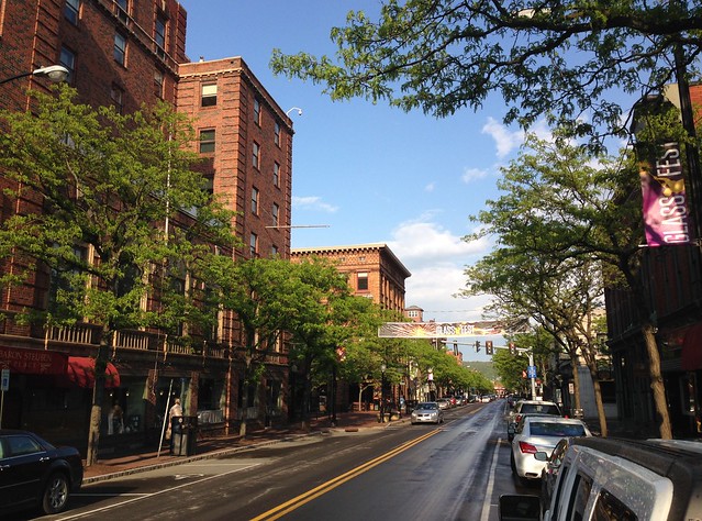
While some Main Streets seem well past their prime, others – like Corning’s – remain thriving to this day. Why? A lot of it has to do with the towns and cities in which they are located, of course; it’s hard to have a well-functioning Main Street in a down-and-out community. But there are also elements of design and context that matter. What are they? The answers matter to sustainability, because traditional Main Streets tend to have central locations and good walkability, both of which reduce carbon and other emissions associated with driving; over time, they also recycle land, buildings and infrastructure.
Here is an attempt to set forth some key elements that I believe can make Main Streets more likely to thrive:
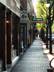
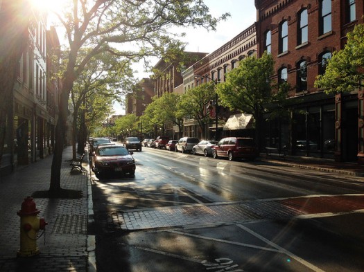
1. A superior pedestrian experience. Main Streets are for walking, browsing, lingering; while they should also be efficient for those looking for a particular item at, for example, a particular pharmacy or hardware store, they have to be highly walkable to succeed. This leads to a lot of potential design features, including ample sidewalks; convenient, well-highlighted crosswalks; vehicle traffic at calm speeds; entertaining, transparent storefronts abutting or very close to the sidewalk; relatively short block lengths; in particularly hot climates, shading.
Motor vehicle traffic is very, very important: I think some of it is actually helpful to the experience, particularly if it draws customers to the street’s businesses and uses on-street parking, with the effect of buffering walkers from moving vehicles. Yet too much of it will kill the feel of the street for walkers. In particular, there should not be too many lanes of moving traffic so as to make street crossings inconveniently long; in most cases, two lanes of moving traffic, one in each direction, should be enough.
2. Density, but at human scale. A Main Street won’t be walkable without a significant minimum density. Yet it shouldn’t be overwhelming, leading to both vehicular and pedestrian congestion, diminishing the pleasure of a leisurely stroll and blocking light. Victor Dover and John Massengale, in their epic and highly recommended book Street Design, write eloquently about the best ratios of building height to street width. Personally, I like a mixture of building heights ranging from two to about eight or so stories. It’s all situational, of course: Fifth Avenue in New York City is a Main Street of sorts and can be terribly exciting for the pedestrian; but a two-story building would be way, way out of place there. That noted, Fifth Avenue is not the kind of smaller-scale, true “Main Street” I’m trying to describe today.
3. Viable local businesses. This one is tricky. So many macro- and micro-economic forces are stacked up against local businesses that I find it remarkable that some do, in fact, survive and thrive. Yet a “Main Street” with only chain stores and no locals (imagine the sort of “lifestyle centers,” outdoor shopping malls, really, that were emerging in the last decade) won’t feel sufficiently authentic to provide a rewarding experience. Some chains are fine, I think; it’s not the 19th century anymore. But not too many.
And, while we’re on the subject of locality and authenticity, I must add that the best Main Streets I tend to encounter are found in places that have a bit of history to them (see my recent article on legacy architecture and continuity of place), and a local economy boosted at least in part by tourism. Corning’s Market Street feels that way: I patronized two restaurants and an art gallery on the street in my two days there, all local businesses; each time, the clientele seemed a mixture of locals and visitors.
I should add that, although a successful Main Street need not be historic, it does seem to help if it is. Dover and Massengale’s Street Design devotes some 35 pages explicitly to Main Streets, with about as many photos; by my count, all but two (excluding illustrative drawings) are of historic streets. (The historic buildings are almost always repurposed, but the architectural fabric remains.) Yet one can find what I might call neo-Main Streets in newer developments, too. The highly successful suburban retrofit Bethesda Row includes a Main-Street-like environment that is exceptionally pleasant; so does the new (and beautiful) Atlanta infill neighborhood Glenwood Park, for which Dover’s firm served as master planners, though the shopping area there is not quite mature. But I think some degree of local businesses may be essential.
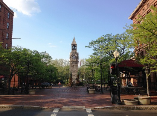
4. Nature. In a shopping district, a little bit of nature can go a long way. Some urbanist designers I know are fond of pointing to historic districts internationally (Florence, for instance), that have almost no greenery downtown. Ah, but look closely and one will see window boxes; hanging baskets of flowers; trees here and there. Our innate biophilic instinct is so strong that humans will find a way to add nature to even the most man-made of places. I maintain that cities need visible and functional nature, and Corning incorporates it beautifully in its street trees. Without them Market Street would not feel nearly so pleasant and alive. Corning also has a small square and park at the heart of the shopping strip.
5. Nearby residences. This is part of walkability, I suppose: I think it helps tremendously if there are residences right on a Main Street, ideally including apartments on the upper floors above the commercial storefronts. (I’m not sure if this is the case in Corning.) But the idea is to have enough residents living nearby to provide a steady clientele to the businesses. They can be supplemented, of course, by patrons who travel to the Main Street and walk once they are there, or by workers in nearby offices; but, if there are no residents at all living close enough to walk, I’m not sure you have a true Main Street. You have something akin to a quaintly designed shopping center.
So that’s what I came up with. I’m curious what others might add to or subtract from the list.
The National Main Street Center, interestingly, avoids a definition or list of preferred characteristics for successful Main Streets. Rather the Center, a subsidiary of the National Trust for Historic Preservation, stresses such streets’ importance, and the organization’s program for revitalizing older commercial districts:
“We all know where our Main Streets are, but do we know what they are and why they matter? Whether they are named First Avenue or Water Street or Martin Luther King Boulevard, what they represent is universal. Main Street is the economic engine, the big stage, the core of the community. Our Main Streets tell us who we are and who we were, and how the past has shaped us. We do not go to bland suburbs or enclosed shopping malls to learn about our past, explore our culture, or discover our identity. Our Main Streets are the places of shared memory where people still come together to live, work, and play.
“So what is Main Street? The phrase has been used to describe everything from our nostalgic past to our current economic woes, but when we talk about Main Street®, we are thinking of real places doing real work to revitalize their economies and preserve their character. Specifically, Main Street® is three things: a proven strategy for revitalization, a powerful network of linked communities, and a national support program that leads the field.”
The most important process elements for a successful Main Street revitalization are elucidated, in part, by a set of ten “national accreditation standards of performance,” each fleshed out with narrative discussion on the Main Street Center’s website. Corning, incidentally, was one of the first communities to participate in the Main Street program when the National Trust began its work on the issue decades ago.
Many cities and towns have detailed Main Street design guidelines, and the state of Oregon offers a 105-page handbook on public infrastructure helpful to supporting good Main Streets. Dover and Massengale’s Street Design mostly teaches by detailing several examples of great Main Streets, but also includes a two-page set of design guidelines from retail expert Robert Gibbs on such matters as storefront design, signage, awnings (ten points on awnings alone!), sidewalks, street furniture, and lighting.
Dover and Massengale are at their best, however, when they sum up the essence of the Main Street experience in a single paragraph:
“While main streets vary, one thing is constant: a successful main street in a sustainable, walkable town or city is a place where people want to get out of their cars and explore. There are many factors that contribute to that, including things to do (like shopping or going to a concert), interesting sites to look at (including people – we like to people-watch), and a level of physical and psychic comfort. As we walk along, we like to feel safe and secure. Beauty is also important to making a place where we want to be.”
I can’t express it any better than that. Corning’s Market Street is a great example. One could do a lot worse than emulating it, with the above five concepts in mind.
Originally published on the NRDC Switchboard and now archived here. Republished with permission. All photos are of Corning, New York, ©2014 by F. Kaid Benfield.
–Kaid Benfield
If PlaceShakers is our soapbox, our Facebook page is where we step down, grab a drink and enjoy a little conversation. Looking for a heads-up on the latest community-building news and perspective from around the web? Click through and “Like” us and we’ll keep you in the loop.


