A Placemaking Journal
Retail: Walkable urban primer with southwest inspiration
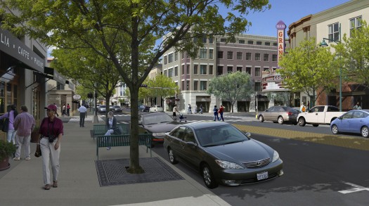
A couple weeks ago, I had the great pleasure of working with Bob Gibbs in Las Cruces, New Mexico, looking at ways to help downtown outperform the suburbs, helping Main Street be more profitable than strip malls. The top lessons were to nurture unique historic character in walkable formats and don’t build leasable space that you can’t lease. For downtown to have a critical mass, the goal is to capture 20% of the retail market share. That’s 10 times the current average of the 2% that most downtowns in the U.S. capture today.

Market preference. First tier cities have thriving downtowns, but also price points that most of us can’t reach. Second tier cities are experiencing an expanded national reach thanks to retiring boomers and millennial preference, but about half of these two massive demographics are looking for active lifestyles in places with character, upping the ante for second tier cities.
Perception and Zoning. There are all sorts of reasons for the current retail imbalance that has created dark and under-performing storefronts in the heart of second tier cities, and some of it has to do with perception. Retailers are biased against locating in poor areas, even though the spending power per acre of poor neighborhoods is usually significantly greater than the suburbs because of greater density. Adding to perception problems is the very real problem of land use, which often favors the suburbs. We’ve blogged extensively about how to level the playing field as well as pointing to the places that are upgrading zoning practices.
Anchors. Trying to build a downtown out of just specialty shops also doesn’t work because form follows anchor. You can only support about 30,000 square feet of retail without an anchor. And that doesn’t necessarily mean a baby box retailer anchoring main street – non-retail amenities like a library, post office, and courthouse are all strong civic anchors.
The Mix. The strategy of all downtowns should start with providing the goods and services that the community wants to buy. Downtowns that are the most successful at competing with the suburbs have a healthy mix of local, regional, and national brands.
Walkability. All national retailers pay attention to WalkScore, often requiring a score of 80 or higher to consider adding a new store. However, in the 51 largest U.S. metro areas, only 12% of neighborhoods are walkable, which is down from 19% in 1970. The 50/50/50 rule says that Main Street retail’s ideal sweet spot enjoys at least 50,000 people earning at least $50,000 per year, or 50,000 cars going by a store.
Rising Tide. It isn’t just retail that benefits from walkable, compact places. Hotels are seeking urban environments because they sell more rooms at higher rates if their guests can walk to restaurants and shops. Universities find they can attract more students and better faculty if there is a vibrant Main Street retail and restaurants.
Retail Merchandising Essentials
Bring home the bacon. The average U.S. mall sells about $275 per square foot per year. The average U.S. downtown independent retailer earns $80 per square foot per year. You need about $200 per square foot per year to support family, so to move most downtowns from being a collection of struggling hobbyists, change is needed.
People do what they see rather than what they read. Signals of storefronts are more important than signage. An open front door is much more welcoming than multiple signs that state the store is open. Rents are about 10% of sales, so developers should work with retailers to get storefronts to send the right signals.
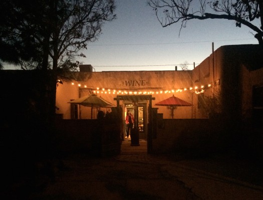
Show the Goods. Retail thrives when the storefront consists of 70% clear glass, so people can “read” the offerings. When the glass has zero tint this reading is easier. Southwestern architecture is largely about thermal mass, so the amount of glazing that retail usually needs to be successful isn’t a part of southwestern adobe or stucco construction, and locals have learned to adapt. Retailers should wash windows once a day and wash doors once an hour.
Keep it Clean. Rodeo Drive has concrete sidewalks, but they power wash them once a week. Don’t gold plate the urbanism, but do keep it clean and welcoming. Keep sidewalks and landscape simple and well designed, so shoppers can focus on the storefronts.
Visual merchandising drives higher sales per square foot. A shopper should be able to understand the store organization in two to three seconds. It takes about eight seconds to walk by an average storefront, and most people decide in two seconds whether or not to walk in.
Honor the Decompression Zone. Once people walk into the store, the first two to three steps should be the decompression zone, where they don’t have to think much. Eyes and ears need this space to transition from the street. A central table at the end of the decompression zone should welcome and orient, and provide at least one sale item.
Wind up for the pitch. Nine out of ten Americans turn right in every store, and Australians do just the opposite. So the flow of the store should cater to this tendency.
This litany is just a small drop in the bucket for what you’ll find in Bob Gibbs book, Principles of Urban Retail Planning and Development, which I highly recommend.
–Hazel Borys
If PlaceShakers is our soapbox, our Facebook page is where we step down, grab a drink and enjoy a little conversation. Looking for a heads-up on the latest community-building news and perspective from around the web? Click through and “Like” us and we’ll keep you in the loop.


