A Placemaking Journal
Lessons Learned from Berlin Shopfronts
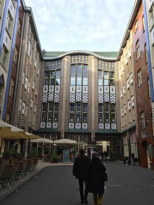
Like many European cities, Berlin teaches us myriad lessons in building successful shopfronts. While the exclusive international shops along Kurfürstendamm and Friedrichstrasse are elegant and effective, the more creative successes are found in neighborhoods and courtyards. Kaid Benfield’s People Habitat describes in detail the reasons Hackeschen Höfe is so successful at the holistic level, and last week Hazel Borys discussed the diversity of uses, so here we’ll just explore the interesting shopfront contributions. There are some very successful shopfront examples in the Prenzlaur Berg neighborhood as well.
Biophilia
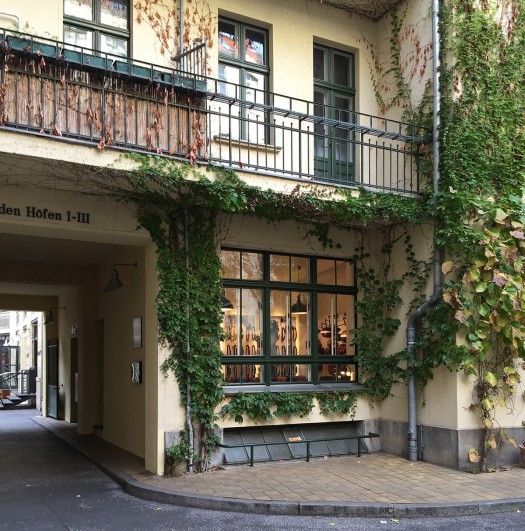
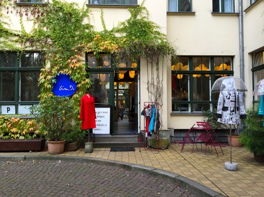
Human biophilia is well documented and very clear, and its value is particularly important in urban environments. Kaid recently discussed in great detail the benefits of introducing nature into cities. One of the most gratifying details of Hackeschen Hofe is the way in which it provides a green oasis in the middle of the city. Each of the seven courtyards are festooned with ivy and many enjoy tree canopy and balcony flowerpots along with fountains and sand pits. The normative condition of the shopfronts is draped in vines. Many are evergreen and, in the late Fall, are particularly attractive. Framing the windows, the vines draw the shopper to the merchandising very effectively.
Pet Perch
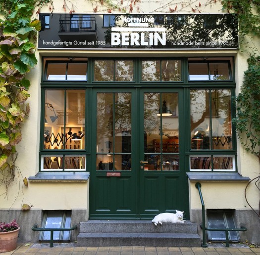
Just as plants attract humanity, animals are also powerful activators. This shop hosts a delightful feline that adorns the step very elegantly. This lesson may not be implementable in more car-centric environments, but it works very effectively for both the pet and the shopper in a pedestrian and cycling environment. The two-step entry into the shop has accessibility challenges, but the pet perch could also be achieved with a small wall framing a planter.
Bicycle Parking
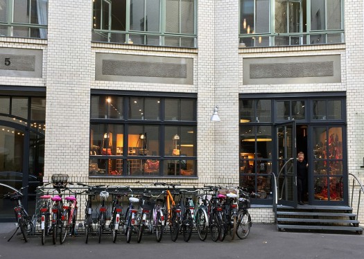
Speaking of a pedestrian and cycling environment, as Kaid mentioned in his book, the five stories of residential above the retail is one of the economic assets for the shops in this series of courtyards. The residents, retailers, and many of the shoppers primarily use bicycles for transportation, and most of the shops in Hackeschen Hofe have ample bike parking in each courtyard. Studies show a notable increase in retail traffic from cyclists and, even for the pedestrian, the color, texture, and design of the bikes draw the eye. It’s making me question the US tradition of placing the bike racks with the street trees adjacent to the curb. Could they be more beneficial to the retailer if they were abutting the building?
Sidewalk Displays
Bob Gibbs has long told us that bringing the merchandise onto the sidewalk is an effective tool for the retailer. However many local governments prohibit this, or require the retailer to rent the space on the sidewalk. While guidelines must be provided to assure the display doesn’t compete with the sidewalk traffic, prohibiting this space to be used by the retailer is in conflict with a city’s economic development goals. Sidewalk signage and displays are critical tools in enticing the shopper into the shop.
Gift to the Street
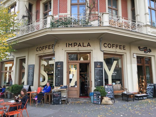
I believe Steve Mouzon first coined the phrase “A Gift to The Street” and providing a place to enjoy the retailer’s product is good, but encouraging the shopper to linger is even better. This image illustrates a great Prenzlaur Berg coffee shop that doesn’t try to turn tables and move folks along. As Andrés Duany often says, there’s nothing more interesting to humans than other humans. There’s also nothing more encouraging to the coffee connoisseur than tables filled at a coffee shop.
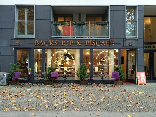
Berlin in fall is a fascinating café culture. To enable dining and lingering in the cool weather, many venues offer warm blankets on the chairs. While this may not be a gift to the street, it certainly is a gift to the diner.
The Trifecta: Good Signage + Great Merchandising + Biophilia
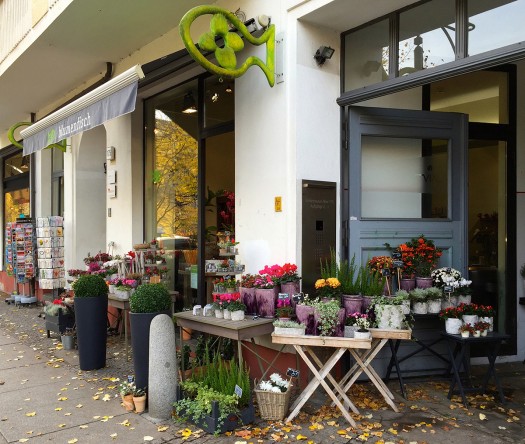
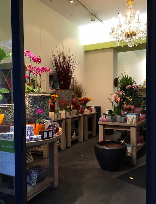
This little Prenzlaur Berg shop hit the trifecta with great signage, creative merchandising, and irresistible biophilia. I was amused and attracted by the blade sign so perfectly representing the name.
The shop space was only 20’ deep and very attractive. However, the sidewalk displays wrapping the corner into the passage were the detail that assured I would spend time in the shop.
When you next visit Berlin, by all means spend time on the great shopping streets like Ku’damm and Friedrichstrasse, but urbanists, architects, and the shopper interested in things only available in Berlin will have a better time in the smaller streets and courtyards of neighborhoods like Scheunenviertal, Prenzlaur Berg, and Kreuzberg.
–Susan Henderson
If PlaceShakers is our soapbox, our Facebook page is where we step down, grab a drink and enjoy a little conversation. Looking for a heads-up on the latest community-building news and perspective from around the web? Click through and “Like” us and we’ll keep you in the loop.


