A Placemaking Journal
Get to Know the Awkwardly-Named “Terminated Vista”
I’ll admit it: I wish there was a more user-friendly way to say “terminated vista.”
Perhaps I’m more sensitive to it because, as regular readers here know, I’m not an urban designer. I just work with them. That means I’m more inclined to scratch my head like any other layperson when I hear wonky expressions that sound far too highfalutin for an everyday community.
That’s too bad, because the terminated vista plays a pivotal role in good community design.
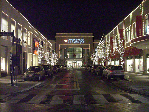
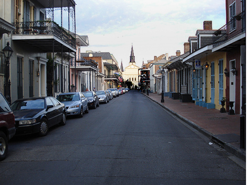
Basically, “vista” refers to your view as you look down a street or corridor. “Terminated” refers to any building, object or feature serving as the focal point and blocking the view from extending further.
Think about when a street angles or dead-ends into another street. For the person heading that way, that spot becomes a focal point of greater prominence, so an urban designer would tell you its building should reflect that. Depending on the importance of the street, the parcel might be suited to an important civic building or monument. Downtown or on Main Street, it might be a church or prominent commercial anchor. Or, in an everyday context, the occupying building should simply make a small architectural nod to its surroundings, noting that it recognizes its enhanced role in community aesthetics and wants to contribute.
According to designers, there’s a variety of reasons for doing this. In their handy compendium, “The Smart Growth Manual,” authors Andres Duany, Jeff Speck and Mike Lydon, explain:
“Street networks that include staggered intersections, deflections, and slight curves improve spatial definition and orientation by creating memorable visual events .. When a street vista terminates on a building, it should reciprocate by placing a special architectural element on axis.”
This, they assert, speaks to community values, contributes to the cues of basic navigation, and reduces car speeds.
Personally, as a layperson, I like them for another reason: They make our communities more interesting, and interesting places engage people at a more intimate, emotional level. When we talk of making places more pedestrian friendly, we often focus on sidewalks, road geometries and diversity of destinations but it’s less often that we also focus on delight — the visual candy that engages our senses as we travel from point A to point B.
At the end of the day, you can build complete streets that provide safe, walkable destinations and amenities but if the surrounding environment’s a bore then it’s a bore and walkability suffers as a result.
As my colleague, Nathan Norris, chides regularly in his Design 101 tutorials: Don’t bore the humans.
Leverage the power of delight. Terminated vistas, both grand and simple, used to be an everyday part of community building. It was just how we did things.
We could do so again. Below are a number of Flickr examples — some old, some new. Roll-over and click for photo credit.
–Scott Doyon

If PlaceShakers is our soapbox, our Facebook page is where we step down, grab a drink and enjoy a little conversation. Looking for a heads-up on the latest community-building news and perspective from around the web? Click through and “Like” us and we’ll keep you in the loop.


