A Placemaking Journal
Ignorance was Bliss: How my urban learnin’ almost ruined everyday places
For ten years I’ve been hanging around with a pretty interesting collection of traditional architects, planners and urban designers. That’s my job. Taking their inherent disciplinary wonkdom and simplifying it for wider appreciation. Doing so means I’m frequently on the sidelines as they work, and a consistent witness to their application of accumulated wisdom to all manner of challenges currently ill served by modern solutions.
That’s put me on the receiving end of something of great professional value. And equally great personal annoyance:
An understanding of what makes great places great.
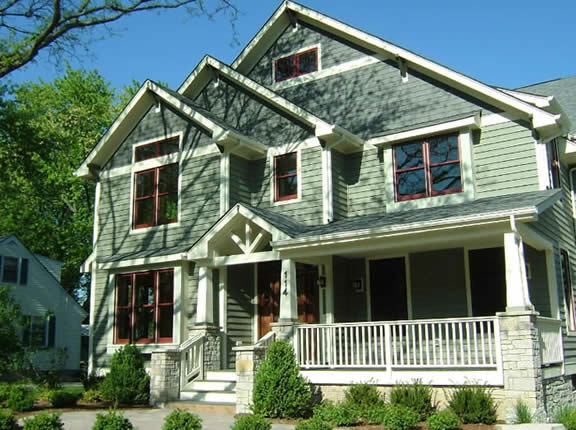
For the bulk of my life I was unencumbered by this burden. I could take a walk through my leafy, hundred year old neighborhood, see a new Craftsman going up, and think to myself, “That’ll fit in nicely. Good job.” Or venture down Main Street in a small town, eyeing antiques and odd finds and marveling at how intimate everything feels. I could even attend a downtown festival, soaking up the ambiance of people, food and music while never once considering how well or how poorly the surrounding buildings were contributing to the experience.
Learning about civic art — the artistry of city design — changed all that. Thereafter, I looked at that new house and saw only its clumsy porkchop eaves, the scourge of unskilled, production labor. And its accessory building, dutifully drawing cars to the rear of the house? I could only lament its awkward siting, unnecessarily rendering part of the backyard unusable while, at the same time, failing to frame any meaningful sense of private space.

Oh, and its porch! Six feet deep?! Who were they kidding?! Eight feet would surely be better, and ten certainly ideal. Not to mention that, based on its proximity to the street, it really needed an extra foot in elevation. The delicate balance between privacy and access was totally blown!
It got worse. Every T-intersection, once just another turn in the intricate maze of getting from Point A to Point B, became mourned for its failure to provide an appropriate vista. Or perhaps it did, in the form of a Target store! What was once the site of a great church or the home of a baron or even a simple background building offering a modest architectural nod to its surrounding context, was now adorned via lessons learned at the mall.
What changed? The places I once enjoyed? No, just me. Because I foolishly learned, from a design perspective, how bad they actually were.
If this were the end of the story, it would be a sad tale indeed. Another true-life example of the adage, “If you’re not outraged, you’re just not paying attention.” But thankfully, amidst the passionate designers and their admirable quests for artistry, were more measured voices, reaching out to pull me in from the ledge a little bit at a time. A growing number of urbanists who, over the years, began suggesting that we not let the idea of perfection be the enemy of the good. In everyday places, they stressed, everyday good is often good enough.

Early on, there was retail guru Bob Gibbs. I remember hearing Bob address the issue of towns struggling to revive Main Street. While many were making significant investments in streetscape improvements, much of the money was ending up in brick pavers and decorative benches, streetlights and trash receptacles. Forget all that, he said. Start by getting the sidewalks right. For the most part, people aren’t concerned about materials. Their backsides don’t really know the difference between a $300 bench and a thousand dollar bench. They simply want a safe and comfortable place to walk and hang out, with safe ways to get back and forth across the street.
It’s the sidewalk, he argued, that brings people together, protects them from traffic, and facilitates commerce. Not the pavers. So focus on the big picture. Do a good job and let the details work themselves out over time.
Another huge influence was Ray Oldenburg and his classic tome, “The Great Good Place,” where he explored the magical chemistry of third places like pubs and coffee houses and how, even though they’re often perfectly average places by most measures, they’re a key part of what ultimately allows community to flourish.
There have been many more. All acknowledging the challenge that, even though everyday good may have historically been exceptionally good, our current inability to regularly meet such standards shouldn’t be viewed as a failure. That kind of collective wisdom is not relearned overnight. Today, in a world that enshrines one’s individual quest to do their own thing, the view of civic design as a shared initiative with shared ideas of what makes a good place, and a good city, is a tough sell. Agreements over arrangement, ornament, and public vs. private space, fine-tuned over hundreds and hundreds of years, do not become normative once again in a couple of decades. There’s much work — big picture work — yet to be done.
There’s a reason people say that God is in the details. Because that’s the level at which our efforts can, but often fail to, reach their full potential. And yet we try nonetheless. Such grand ambitions are important, even vital to our evolution. But it’s equally important to remember that, while greatness is a powerful motivator, community can just as easily thrive in the presence of goodness.
It’s going to take one good place at a time to reintroduce us to just how good good can be.
–Scott Doyon


