A Placemaking Journal
The Sidewalk to Hell is Paved with Good Intentions
Sometimes all the right people seem to be at the table, all singing from similar hymnals, and all seemingly focused on transcending growth-as-usual and yet, still, the results fall flat.
Today we look at one of those times.
The scenario
Imagine this:
- A site area that retailers describe as a “100% corner.” That is, the convergence of several high-volume arterials with substantial levels of traffic. In this case, roughly 100,000 cars collectively each day. So clearly an area with considerable potential to serve as a successful and meaningful amenity for surrounding neighborhoods.
- The area, previously characterized by midcentury strip retail and car dealerships, was the subject of a collaborative vision plan funded by the regional growth agency wherein a broad array of stakeholders spelled out ambitions for town center-styled redevelopment.
- The governing municipality has an articulated commitment to sustainability and was amenable to a mixed-use rezoning.
- The developer was not new to mixed-use development.
- Surrounding neighborhoods were extremely engaged and participatory in creation of the development proposal.
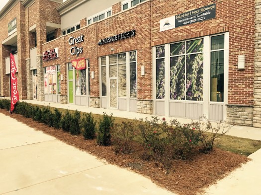
Ripe for possibility, no? Yet somehow, in the presence of so much potential, the result (in part) was this:
Let’s dissect, shall we? First, acknowledging the good:
- The building adjoins the sidewalk.
- A second story allows for small business offices and studio space, while also providing a more substantial street wall.
- The parking is located behind the building.
That’s the point where the process moves beyond the fairly basic siting and programming issues and gets down to the level of design. Which is where everything starts to fall apart.
Below I detail how the best of intentions ultimately resulted in something universally experienced as meh.
- There was clearly a desire or stipulation that there be pedestrian-focused entrances at the sidewalk. But there’s no provision that those entrances remain unlocked. Instead, they’re adorned with a variety of “please use other entrance” signage. That other entrance, incidentally, is on the back side of the building serving the parking lot. Why not use both entrances? Because format retailers don’t want to deal with that.
- There’s an effort (perhaps a requirement) to feature a healthy percentage of window glass yet there’s no stipulations for transparency. As a result, each storefront is obscured with large format advertisements for the businesses inside. Ironically, sufficient and unobscured windows are a requirement of urban retail because the resulting window displays and goings-on inside become infinitely more interesting living advertisements, beckoning customers inside. But again, retailers don’t want to deal with a second entrance.
- The desired (perhaps required) sidewalk proximity intended to cultivate a pedestrian-oriented retail environment is instead adorned with nature band-aid landscaping that separates pedestrians from the businesses they’re expected to patronize. No tragedy, of course, because who’s walking that terrible street anyways? Chicken, meet egg.
We’ve spent nine years here on PlaceShakers exploring how communities can avoid exactly these types of issues. And before us, many other practitioners dating back to the 70s and 80s, working diligently to unearth the wisdom of our most-loved places so that new places of comparable quality can be built. And still…
The adage that comes to mind is this: There’s a reason that engineers say the Devil’s in the details while designers say that that’s where you find God. Things either whither or blossom when you get down deep in the weeds.
Today’s sermon? The details matter, particularly from a regulatory standpoint. Aim higher.
–Scott Doyon
If PlaceShakers is our soapbox, our Facebook page is where we step down, grab a drink and enjoy a little conversation. Looking for a heads-up on the latest community-building news and perspective from around the web? Click through and “Like” us and we’ll keep you in the loop.


